
iNFOGRAPHIC
"If we let science do the talking you'd hear that the brain is a real sucker for visual information." JIU University
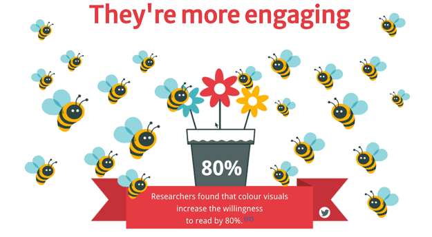
Info graphics are a visually stunning way to deliver facts and statistics. YOU can make YOUR own infographics to explain data. There are some great infographic portals like Statista you can use.
They also require lots of research, reading, and analysis to create.
Start with simple visuals, older students can work out formulas for areas of circles squares etc and represent them as proportional percentages, and make art math masterpieces. This turns data into a landscape you can explore with your eyes, an information map. We are all visualisers now. There is something quite magical about visual information it is effortless.

LOOK at EXAMPLES
Check out this one from Junk charts
Snake Oil Supplements Scientific Evidence for nutritional supplements
Check out the rest of their data info at Information is Beautiful - use the menu bar to see the visuals.
5 MAIN REASONS

1. To represent data.
2. To tell a story.
3. To illustrate facts or research.
4. To illustrate a timeline.
5. To demonstrate a process, flowchart.
Take a look at the InfoGraphic - Thirteen Reasons Why your Brain Craved InfoGraphics
WATCH the VIDEO
The Beauty of Data Visualization - David McCandless (stage 3 and up)
David McCandless turns complex data sets, like worldwide military spending, media buzz, and Facebook status updates, into beautiful, simple diagrams that tease out unseen patterns and connections. Good design, he suggests, is the best way to navigate information glut.
And it may just change the way we see the world.
MAKE your OWN

Easelly - make your own info graphic online and download or share with others.
I love these simple infographics from Easelly
With two colours and two labels, it’s hard to miss each infographics big point. Especially the chickens.
Easelly allows users to create visual ideas online. You can choose from a series of templates or start from scratch and upload your own images.
CANVA is a fabulous option for creating iNFOGRAPHICS with Educational use for many pro features for FREE.
Here’s a link to an animated gif I made in Canva for a profile picture.
251124
© Cathy Brown 1998 - 2026 © All images & Videos Cathy Brown Located in Sydney NSW Australia or Malta all rights reserved.
No unauthorised reproduction without written permission. Webmaster & Designer - Cathy L. Brown

Virtual Teacher is committed to ensuring that our AI systems & assistants are used responsibly & ethically. Our AI is designed to support educators & students by providing personalized learning experiences, enhancing engagement & promoting understanding. We prioritize the safety, privacy, & security of our users, ensuring that our AI tools operate transparently & align with the best practices in the industry.
The NSW AI Assessment Framework requires self assessment to deterimin whether your system / project should use the AIAF. All AI projects used by Virtual Teacher are Low Risk or No Risk applications.
Check out the Risk Evaluation page attached.